Part I - Your Camera and Using Backgrounds
We've all heard it a million times! Each time we set up a photo session we need to remember that our customer can't hold or feel the gorgeous piece of jewelry we’ve created, so we must strive to constantly improve our photography.
We can enhance our photography by using backgrounds, props, and features offered within your favorite photo editing software. However, before we start thinking about any of this we need to understand our camera and adjust the settings for the best pictures possible.
All cameras are different and since I’m no camera expert I will direct you to these links for guidance:
Tip: Dig out the manual that came with your camera. If you can’t find it, do an internet search for the model's instruction manual and you may be able to find it online.
There are many different photography set-ups that don’t need to be expensive in order to be effective. Personally, I use a light box made from a computer box (the inside was already pure white) with clip on lights and a tripod. Other set-ups may include using a table near a sunny window, going outdoors during the morning, or perhaps something entirely different. The first step to great photography is to adjust your camera settings for your particular set-up.
Make sure you have good lighting to eliminate shadows and create bright, crisp photos. You could have the most expensive camera in the world but your pictures wouldn’t be effective if you took them in a dark room by candle light.
Okay, you’ve got your camera adjusted, now what?
Background…
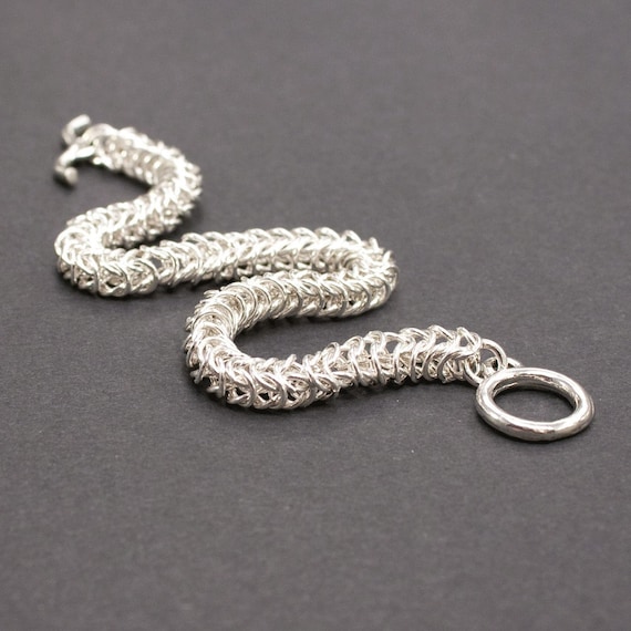
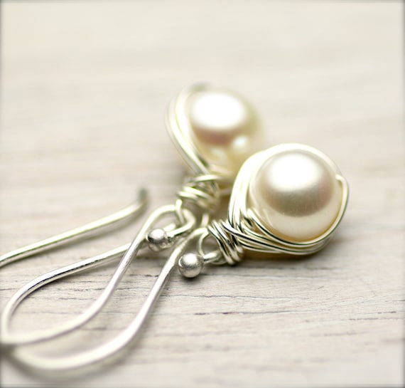
A background can make or break your photo. Remember, you’re selling jewelry not that really awesome piece of fabric you found in the sale bin down at “
Fabrics Are Us”.
Let’s talk color. There has been quite a bit of discussion on
Etsy about the background color; “Should it be white?” or “If it’s black, will that limit my treasury and front page chances?”
I really don’t think any of that matters. If you look at the front page treasuries about half the photos have a white background and the other half have something else. What’s more important selling your jewelry or being on the front page? Well, of course selling jewelry! In order to sell jewelry you must attract customers using your awesome photographs. Use a background that really makes your pieces pop on camera.
You want a neutral color that compliments your jewelry such as black, white, off white, beige or grey. Don’t think you must stick to a single color. Perhaps you could use white as your primary background and use black in one of the thumbnails. You may find that some of your pieces are hard to photograph on one background but really look good on another. Play around with a few and see which you like best.
Another thing to consider is the color scheme for your brand or packaging. If part of it’s in the neutral family, use it to your advantage and then pick up one of your other colors with a prop, which we will talk about in the next post.
Now that you’ve decided on a color let’s look at texture. You can have some texture in your background without being too distracting, just don’t go overboard. You wouldn’t want to use a chenille bedspread or gold sequined fabric for instance.
A great source for backgrounds can be found in the scrapbooking section of a craft store. Many solid color papers are smooth on one side and have a slight texture on the other. I use black paper for my dark background and watercolor paper with white vellum for my light background. I also found a great piece of beige, vintage looking paper, with writing on it. It would be too overpowering to use by itself but it’s perfect when I lay a few sheets of vellum on top. The overall color appears more white and the writing is just barely noticed. This trick would work with any patterned paper to give a subdued look. You may need to use more than one sheet of vellum to reach your desired appearance.
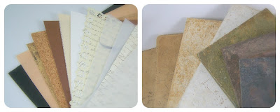 |
| Scrapbook paper and tiles |
Other possible backgrounds include fabric, tiles from the home improvement store, an slab of wood, or even sand. Experiment, have fun, and look around for other possibilities.
Tune in next time for Part II - Using Props!


19 comments :
Great tips! Thanks for sharing!
Thank you, Wendy! Super photos you've chosen! I especially like the suggestion about the scrapbooking papers and the vellum!
Great info. Thank you Wendy.
Wonderful post! I use natural lighting usually in the morning. I lay my item on watercolor paper and use another page of the same in the back of the photograph to bounce light off of onto the object. This works wonders! A good macro lens helps as well. I'm using a really old Zeiss lens from my Sony camera.
Great photos Wendy!! And thanks for the tips!
Great post!
Great tips!!!!
Thanks for all the good info!!
Fabulous post Wendy! Images are SO important. I use vellum, even over a plain white background. I can tell a difference if I don't. I love Paper and More for vellum. They have reasonable shipping and you can order sample packs or create a mix and match order. http://www.paperandmore.com/cat_vellum_paper_white_cream.html
Looking forward to the props post! Thank you Wendy!
Wendy...this is great info to have and use!!! Thanks also to Jill for the link...I have to say the examples you used are EXQUISITE!!! The JET TEAM is ROC/<ING the photos!!!
These are such wonderful tips, Wendy. I take all my photos inside since I never can find a suitable place in the yard with the sun at the proper angle. Really looking forward to reading Part 2. Thank you, Jill, for the link to Paper and More.
great info here, thanks Wendy!
Loads of great tips. Thank you for posting!
Great post. I am always having problems with what backgrounds to use.
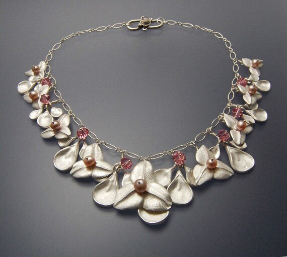
Fabulous post! I hadn't hear of the vellum trick- I'm going to try that. Thank you for including my bracelet!
Fantastic post and photos!
amazing tips, the wood and vintage paper background is definitely interesting, I'll try your suggestion with my personal touch of course. thank you for sharing
This post was great. I use scrapbook squares a lot.
Post a Comment